
The Foundations
Core #1

🤼♂️ Fighting for a lose
I have been writing a couple of drafts, some more complex than others, while trying to figure out what I wanted to do with this newsletter.
After discarding a few ideas, including exploring something similar to a "design systems news bulletin" and another about how I feel working in a field that's so...on the cutting edge of development, I stumbled upon the idea of talking about what I like to call "the framed-flexibility."
But Amy summed it up perfectly in a beautiful tweet. ↩

What makes this tweet resonate with me is the day-to-day experiences of a maintainer of a system within a corporation.
What do we do beyond adding new use-cases to our components? Is there more to governance than just the system? Can it be automated? What should we really be focusing on?
Or maybe you’re looking for ways to help designers transition from working in Sketch?
I hope to answer all of these questions in the near future, as I have just started this journey and want to take my time with it.
🌎 Craftsmanship
In this section, I'd like to share some technical knowledge that I find interesting and important for a professional system. I will break it down into simple steps for any systems designer who may want to build it as well.
The first time I saw this idea, it was in ReShaped by Dmitry Belyaev.
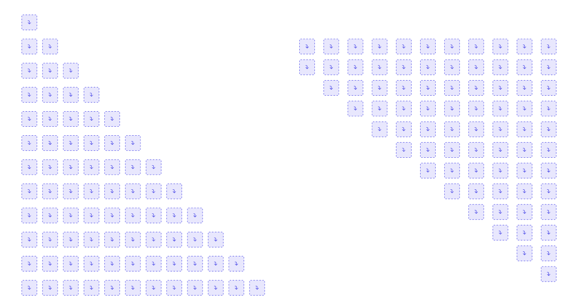
This “slots” with a little bit of tweak, allows you craft complex scenarios in minutes.
🧠Think. Deploy.
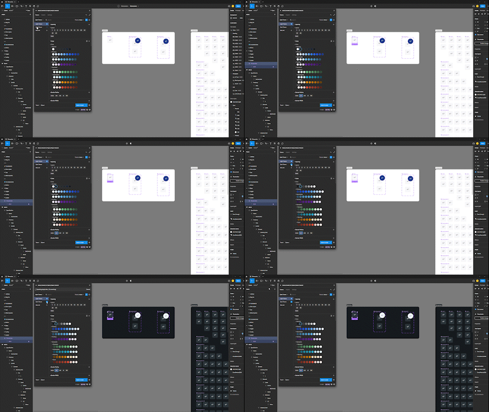
To begin with, you'll require a ❖ Placeholder, which will act as the foundational element throughout the entire process.
As part of my public design system, Dimension, I've configured Tokens Studio on Twitch so everything will automatically change between themes.✨
After creating the ❖ Placeholder, there are two additional elements that must be set up.
❖ Offset
❖ Absolute Position
Offset


In order to define each position, we must create a component for each one and nest our ⍚ Placeholder inside.
It's important to set the height and width of these components to 0,0 since they will be re-nested to the ❖ Absolute Position.
When using Auto-Layout, make sure to set the position of the component to be the inverse of its parent (for example, if we want the item to be at the bottom, set the Auto-Layout to top). Additionally, set the constraints to Left-Top for better resizing.
Absolute Positioning
Next, you'll need to create a new component, which in my case, I'll name ❖ Absolute Position.
Attach the ⍚ Offset in the center of this component and set the Auto-Layout correctly for each position. If you want the ⍚ Offset to be located at the bottom, set the Auto-Layout to bottom.


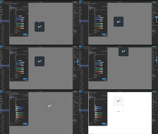
Tweaking the Slots


The final step is to create a boolean in your ❖ Placeholder and nest the ⍚ Absolute Position inside it.
When doing so, ensure that the constraints are set to Top-Bottom and Left-Right for proper resizing. Then, expose the ⍚ Absolute Position.
Congratulations! ✨
You now have a functional ❖ Placeholder that can be placed into any position without detaching or adding additional elements. This will streamline your design system and make it more efficient.
📍 Andalucía, Spain


